
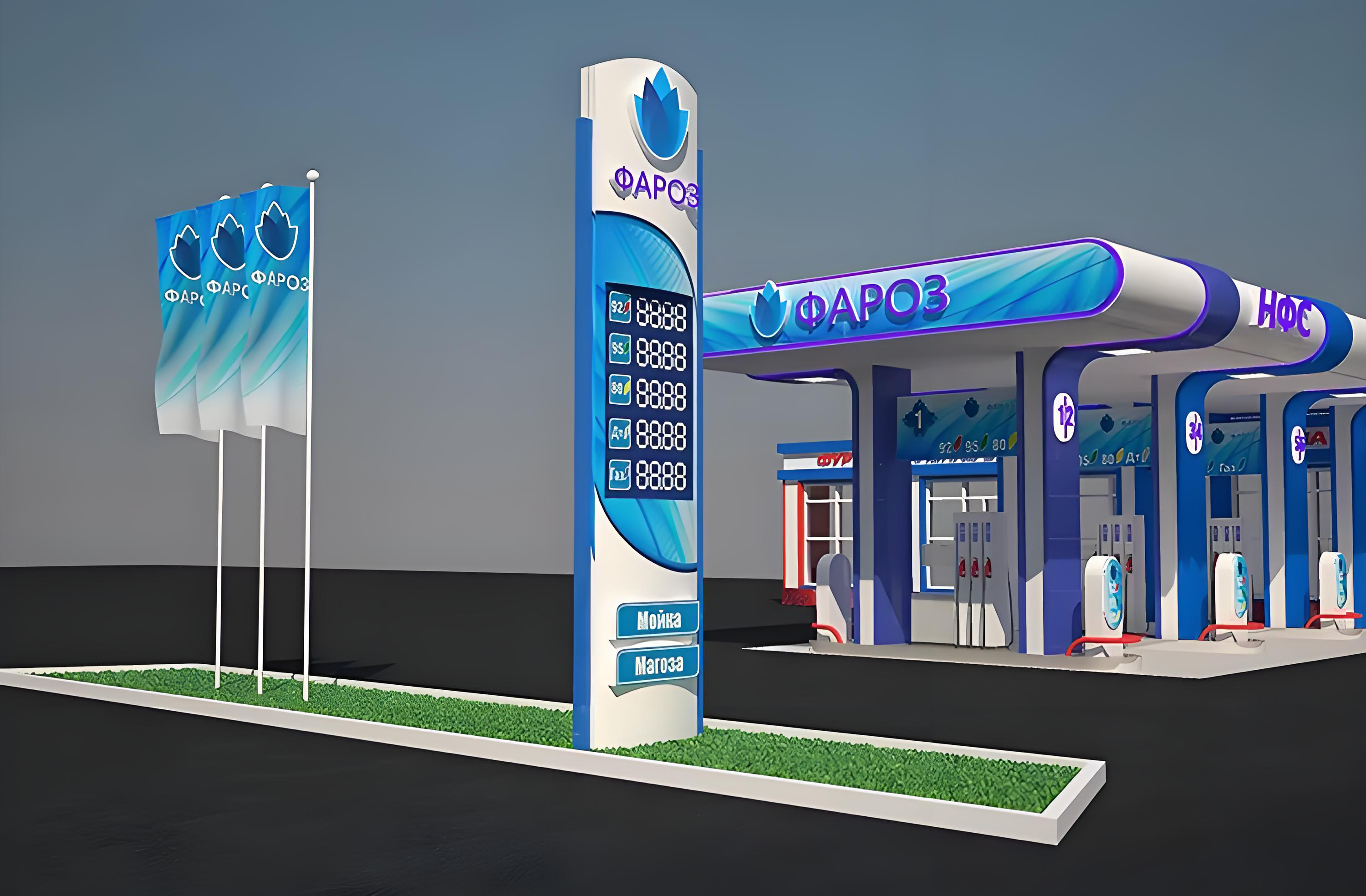
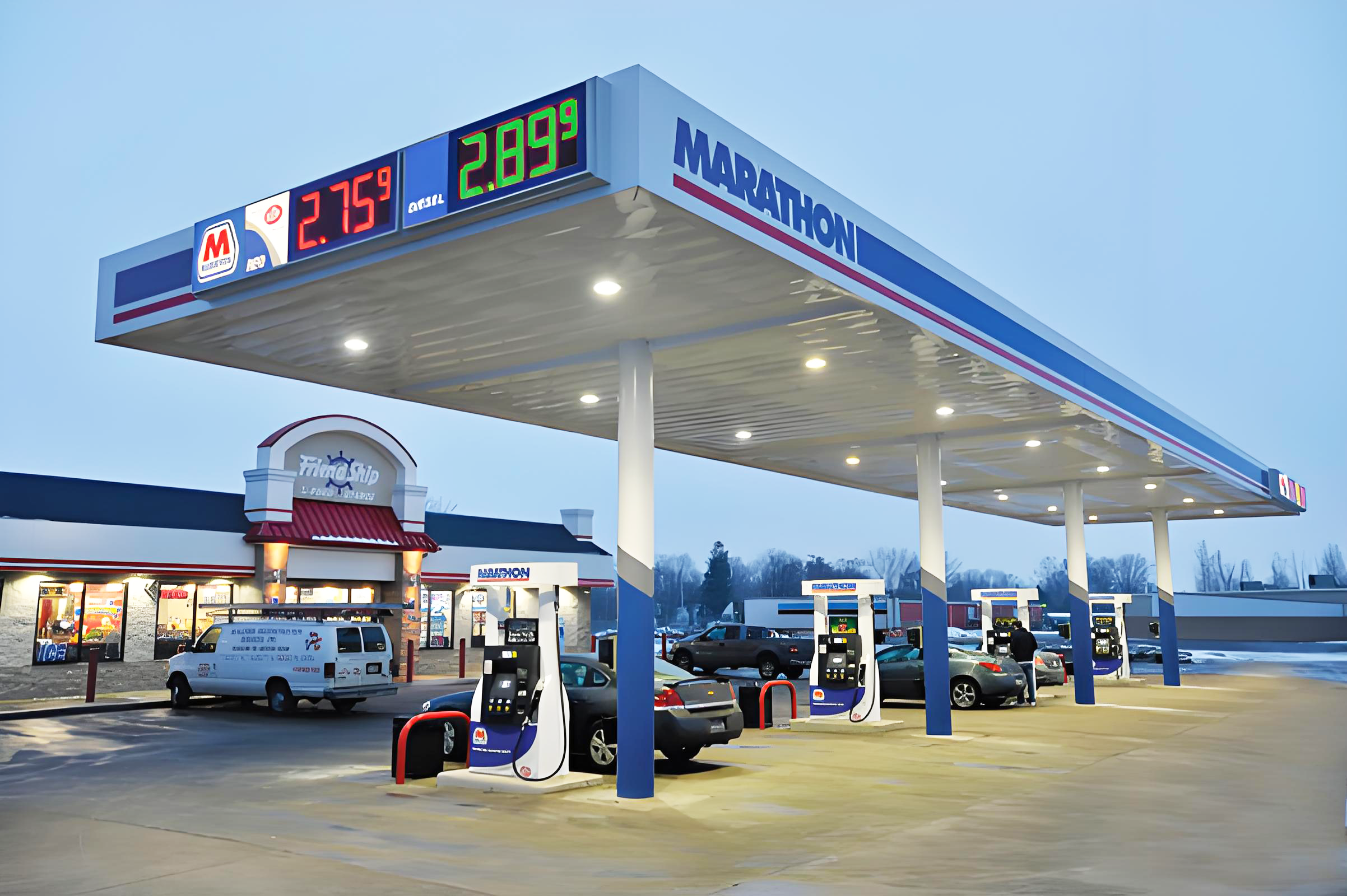
In the competitive landscape of fuel retail, effective signage can make the difference between attracting customers and being overlooked. While many business owners assume that bright colors, complex graphics, and numerous elements create the most eye-catching gas station sign, research and real-world experience suggest otherwise. The psychology of visual communication reveals that minimalist designs often outperform their flashy counterparts in capturing attention and driving customer action. Understanding why simplicity wins in gas station sign design is crucial for fuel retailers looking to maximize their marketing investment and improve brand recognition.
The Science Behind Visual Processing and Attention
How the Human Brain Processes Visual Information
The human visual system is designed to process information quickly and efficiently, particularly when making split-second decisions while driving. When motorists approach a gas station sign at highway speeds, they have mere seconds to absorb and process the information displayed. Complex designs with multiple elements, colors, and messages create cognitive overload, forcing the brain to work harder to extract meaningful information. This increased processing time often results in drivers missing key details or simply ignoring the signage altogether.
Neuroscience research demonstrates that the brain prioritizes clear, simple patterns over complicated ones. A well-designed gas station sign leverages this natural tendency by presenting information in a format that aligns with how our visual cortex processes data. Simple shapes, high contrast ratios, and minimal text allow for faster recognition and comprehension, making the message more memorable and actionable for potential customers.
The Role of Cognitive Load in Decision Making
Cognitive load theory explains why minimalist gas station sign designs are more effective at influencing consumer behavior. When faced with too much visual information, the brain enters a state of analysis paralysis, where decision-making becomes delayed or avoided entirely. Drivers experiencing high cognitive load from complex signage are more likely to continue past a fuel station rather than stop and process the overwhelming visual message.
Effective gas station sign design reduces cognitive load by focusing on essential information such as brand identity, fuel prices, and basic services. This streamlined approach allows motorists to quickly assess whether the station meets their needs without experiencing mental fatigue. The reduced processing effort translates to increased likelihood of customer engagement and ultimately higher conversion rates for fuel retailers.
Design Principles That Maximize Impact
The Power of White Space and Negative Space
White space, also known as negative space, plays a crucial role in creating effective gas station sign designs. Rather than being empty or wasted space, these areas provide visual breathing room that enhances the impact of key elements. A gas station sign that incorporates generous white space around text and graphics appears more professional and easier to read from a distance. This design approach also creates a sense of premium quality that can positively influence customer perception of the fuel station.
Strategic use of negative space also improves legibility at various viewing distances and lighting conditions. During nighttime hours or adverse weather conditions, gas station sign designs with adequate spacing between elements maintain their readability better than cluttered alternatives. This consistency in visual performance across different environmental conditions ensures that the signage remains effective throughout all operating hours.
Typography and Readability Optimization
Font selection and text hierarchy significantly impact the effectiveness of any gas station sign. Minimalist designs typically employ clean, sans-serif typefaces that maintain legibility at high speeds and long distances. These fonts avoid decorative elements that can become illegible when viewed quickly or from far away. The emphasis on readability ensures that critical information such as fuel prices and brand names are communicated clearly to potential customers.
Proper text sizing and contrast ratios are fundamental to creating an effective gas station sign that performs well in various lighting conditions. Dark text on light backgrounds or light text on dark backgrounds provides the highest contrast ratios, making information easily discernible even in challenging visual environments. This attention to typographic detail demonstrates professionalism and reliability, qualities that motorists value when choosing where to refuel their vehicles.
Color Psychology and Brand Recognition
Strategic Color Selection for Maximum Visibility
Color choices in gas station sign design significantly influence both visibility and brand perception. While flashy designs often rely on multiple bright colors that compete for attention, minimalist approaches use a limited palette that enhances rather than overwhelms the message. Research in color psychology reveals that certain color combinations naturally draw the eye while maintaining professional appearance standards that build customer trust.
High-contrast color schemes work particularly well for gas station sign applications because they remain visible across different lighting conditions and viewing angles. Classic combinations such as blue and white, red and white, or black and yellow provide excellent visibility while conveying different brand personalities. These proven color relationships have been tested extensively in outdoor signage applications and consistently deliver superior performance in terms of customer recognition and recall.
Building Brand Consistency Through Minimalism
Minimalist gas station sign designs excel at building brand consistency because they focus attention on core brand elements rather than decorative features. When fuel stations maintain consistent visual identity across all touchpoints, customers develop stronger brand recognition and loyalty. This consistency extends beyond the primary signage to include price displays, canopy graphics, and interior design elements that reinforce the overall brand experience.
Brand consistency also supports premium positioning strategies that allow fuel retailers to compete on factors beyond price alone. A professionally designed gas station sign communicates quality and reliability, encouraging customers to choose the location even when prices are slightly higher than competitors. This brand equity becomes particularly valuable during periods of intense price competition in the fuel retail market.
Environmental Factors and Durability Considerations
Weather Resistance and Longevity
Outdoor signage faces constant exposure to environmental challenges including UV radiation, temperature fluctuations, precipitation, and wind loads. Minimalist gas station sign designs often prove more durable than complex alternatives because they use fewer materials and simpler construction methods. This reduced complexity translates to fewer potential failure points and lower long-term maintenance requirements for fuel station operators.
Material selection becomes particularly important for gas station sign applications where durability directly impacts return on investment. High-quality substrates, weather-resistant inks, and protective coatings ensure that signage maintains its professional appearance throughout years of outdoor exposure. Minimalist designs age more gracefully than complex graphics because fading or wear affects fewer visual elements, allowing the signage to remain effective longer.
Maintenance and Cost Efficiency
The operational benefits of minimalist gas station sign design extend beyond initial installation to include reduced maintenance costs and simplified replacement procedures. Simple designs require fewer specialized materials and less complex fabrication processes, making repairs and updates more cost-effective. This economic advantage becomes significant over the typical lifespan of outdoor signage installations.
Energy efficiency considerations also favor minimalist approaches, particularly for illuminated gas station sign installations. LED lighting systems work more effectively with simple designs that distribute light evenly across the display surface. This improved light distribution reduces energy consumption while maintaining optimal visibility, supporting both environmental sustainability goals and operational cost management objectives.
Consumer Behavior and Decision Making
The Speed of Modern Decision Making
Contemporary consumers make purchasing decisions more quickly than previous generations, particularly for routine purchases like fuel. This accelerated decision-making process favors gas station sign designs that communicate key information instantly without requiring extended analysis. Minimalist approaches align perfectly with these behavioral patterns by presenting only essential information in an easily digestible format.
Mobile device usage and shortened attention spans have further compressed the time available for signage to make an impact. Modern motorists expect to understand a gas station sign message within seconds of first viewing, regardless of traffic conditions or environmental distractions. Designs that fail to communicate quickly and clearly risk being ignored in favor of competitors with more effective visual communication strategies.
Trust and Reliability Signals
Professional appearance significantly influences consumer trust, particularly in the fuel retail industry where safety and reliability are primary concerns. A clean, minimalist gas station sign design signals competence and attention to detail, qualities that customers associate with well-maintained facilities and quality fuel products. This perception of professionalism can differentiate a fuel station from competitors operating with outdated or poorly maintained signage.
Customer confidence in fuel quality and service standards often begins with first impressions created by exterior signage. Gas station sign designs that appear current, well-maintained, and professionally executed suggest that the business owner invests in quality across all operational areas. This positive association encourages customer trial and supports premium pricing strategies that improve profit margins for fuel retailers.
Technology Integration and Future Trends
Digital Display Capabilities
Modern gas station sign technology increasingly incorporates digital elements that benefit from minimalist design principles. LED price displays, digital message boards, and programmable graphics systems perform optimally when presenting simple, clear information rather than complex animations or multiple simultaneous messages. This technological evolution reinforces the advantages of minimalist approaches in contemporary signage applications.
Digital signage systems also offer opportunities for real-time content updates that keep gas station sign messaging relevant and timely. However, the technical capabilities of these systems work best when paired with restrained design approaches that prioritize readability over visual complexity. The most successful digital installations balance technological sophistication with design simplicity to achieve maximum customer impact.
Sustainability and Environmental Responsibility
Environmental consciousness increasingly influences business decision-making, including signage selection and design choices. Minimalist gas station sign designs often support sustainability goals through reduced material consumption, simplified manufacturing processes, and improved energy efficiency in illuminated applications. These environmental benefits align with growing consumer expectations for responsible business practices.
Sustainable signage solutions also demonstrate forward-thinking business management that appeals to environmentally conscious customers. A thoughtfully designed gas station sign that balances visual impact with environmental responsibility can serve as a tangible expression of corporate values that differentiate the business from less conscientious competitors in the market.
FAQ
What makes a minimalist gas station sign more effective than complex designs
Minimalist gas station sign designs work more effectively because they reduce cognitive load on viewers, allowing for faster information processing and decision-making. Simple designs with high contrast and clear typography remain legible at highway speeds and various lighting conditions, making them more practical for automotive audiences who have limited time to process visual information.
How does color choice impact gas station sign performance
Strategic color selection significantly affects gas station sign visibility and brand recognition. High-contrast color combinations like blue and white or red and white provide optimal legibility across different environmental conditions while supporting consistent brand identity. Limited color palettes also age better and maintain professional appearance longer than complex multi-color designs.
What are the long-term cost benefits of minimalist signage design
Minimalist gas station sign designs offer superior long-term value through reduced maintenance requirements, simplified replacement procedures, and improved durability. Simple designs use fewer materials and construction methods, resulting in fewer potential failure points and lower ongoing operational costs. These economic advantages compound over the typical lifespan of commercial signage installations.
How do environmental factors influence gas station sign design decisions
Environmental exposure significantly impacts signage durability and performance, making design simplicity advantageous for outdoor applications. Weather-resistant materials work more effectively in minimalist designs because there are fewer complex elements that can degrade over time. Additionally, simple designs maintain their visual impact even when minor weathering or fading occurs, extending the effective lifespan of the signage investment.