The Psychology Behind Signage Colors and Driver Behavior
The subtle interplay between exterior signage color and human psychology creates a fascinating dynamic that influences driver decisions in mere milliseconds. When motorists navigate busy streets, their brains process visual information at lightning speed, making rapid judgments about whether to stop at a business. This split-second decision-making process relies heavily on the visual impact of exterior signage, with color playing a pivotal role in capturing attention and triggering specific emotional responses.
Research in environmental psychology and consumer behavior has demonstrated that up to 80% of the information processed by our brains is visual, with color being one of the most impactful elements. The strategic use of exterior signage color can mean the difference between a potential customer driving past or making that crucial decision to pull in.
The Science of Color Psychology in Outdoor Advertising
Emotional Responses to Different Sign Colors
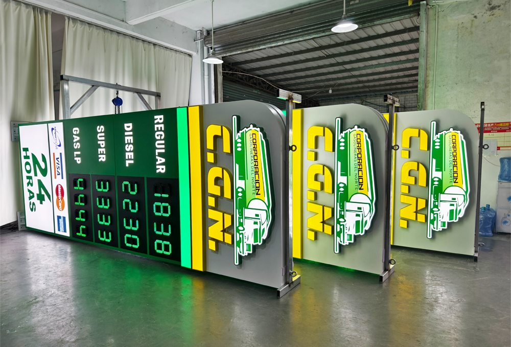
Each color in exterior signage triggers distinct emotional and psychological responses. Red, for instance, creates a sense of urgency and excitement, making it particularly effective for fast-food restaurants and clearance sales. Blue evokes trust and reliability, explaining its prevalent use in banking and healthcare facility signage. Yellow, highly visible from a distance, captures attention and generates feelings of optimism, while green often associates with health, nature, and environmental consciousness.
Understanding these color-emotion connections allows businesses to strategically design their exterior signage to align with their brand message and target audience expectations. The right color combination can communicate your business values and offerings before customers even read the text.
Visual Processing and Driver Recognition
The human brain processes color before it registers shapes or text, making the exterior signage color crucial in that split-second window of driver attention. Studies show that color increases brand recognition by up to 80%, and drivers typically have only 3-5 seconds to notice and process signage while maintaining safe driving practices.
Contrast plays a vital role in this quick recognition process. High-contrast color combinations in exterior signage ensure better visibility and readability from greater distances, giving drivers more time to make the decision to stop. This explains why many successful businesses opt for bold, contrasting color schemes in their signage design.
Strategic Color Selection for Maximum Impact
Environmental Considerations
The effectiveness of exterior signage color choices must account for the surrounding environment. Urban settings with numerous competing signs require different approaches than suburban or rural locations. Natural lighting conditions, weather patterns, and seasonal changes all influence how colors appear and perform throughout the day and year.
Smart businesses consider their location's specific characteristics when selecting signage colors. A sign that stands out brilliantly in bright daylight might become less effective at dusk or in overcast conditions. The most successful exterior signage designs account for these variables with thoughtful color selection and lighting solutions.
Target Demographic Response Patterns
Different demographic groups respond uniquely to various color combinations in exterior signage. Age, cultural background, and gender can all influence color perception and preference. For instance, younger audiences often respond positively to bold, vibrant colors, while older demographics may prefer more traditional, subdued color schemes.
Businesses must align their exterior signage color choices with their target market's preferences and expectations. This alignment strengthens brand recognition and increases the likelihood of attracting intended customers.
Implementation Strategies for Effective Color Usage
Color Hierarchy and Balance
Successful exterior signage employs a strategic color hierarchy that guides the viewer's eye and emphasizes key information. Primary colors establish the main visual impact, while secondary and accent colors support the overall design without creating visual confusion. This balanced approach ensures that drivers can quickly grasp the essential message while traveling at various speeds.
Color distribution within the sign must be carefully planned to maintain visual harmony while maximizing visibility and impact. The 60-30-10 rule, commonly used in design, can be adapted for exterior signage to create balanced and effective color schemes.
Testing and Optimization Methods
Before finalizing exterior signage color choices, businesses should conduct visibility tests under different conditions and viewing distances. Digital simulations and physical prototypes help evaluate how color combinations perform in real-world situations. Regular monitoring and adjustment of signage elements ensure continued effectiveness as environmental conditions change.
Modern technology allows for sophisticated color testing methods, including eye-tracking studies and virtual reality simulations. These tools provide valuable insights into how drivers perceive and react to different color combinations in exterior signage.

Frequently Asked Questions
How do weather conditions affect exterior signage color visibility?
Weather conditions significantly impact color visibility in exterior signage. Bright sunlight can wash out certain colors, while rain and fog can reduce contrast and overall visibility. The best exterior signage designs account for these variables by using high-contrast color combinations and considering local weather patterns in the color selection process.
What colors are most effective for nighttime visibility in exterior signage?
Colors with high luminance values, such as white, yellow, and light blue, typically perform best for nighttime visibility. When combined with proper illumination, these colors maintain their impact and readability in low-light conditions. However, the effectiveness also depends on the background environment and lighting conditions of the surrounding area.
How often should exterior signage colors be updated to maintain maximum impact?
While there's no universal timeline for updating exterior signage colors, businesses should evaluate their signage effectiveness every 3-5 years. Factors to consider include color fading, changes in brand identity, shifts in target demographic preferences, and evolving industry trends. Regular maintenance and periodic refreshes help maintain the signage's visual impact and effectiveness in driving customer decisions.

